Receiver operating characteristic plots
Receiver operating characteristic plots
This article covers the fifth paper in the series of statistics notes (Altman & Bland, 1994) ( lit-altman_bland.md ): 5. Altman DG, Bland JM. (1994) Diagnostic tests 3: receiver operating characteristic plots. 309, 188, and concerns quantitative diagnostic tests. 1 Diagnosis based on yes or no answers are covered in another note by Bland and Altman. The same statistical methods for quantifying yes or no answers can be applied here when there is a cut off threshold for defining normal and abnormal test results. For simplicity, I will call someone who is diagnosed by a clinical test a “case” and someone who is not diagnosed by a test/healthy/normal, a “control”. These terms are incorrect but much simpler to repeatedly read than “people who are diagnosed by a test”.
The receiver operating characteristic (ROC) plot can be used measure how test results compare between cases and controls. Altman and Bland mention that this method was developed in the 1950s for evaluating radar signal detection. An aside for history buffs, from wikipedia:
The ROC curve was first used during World War II for the analysis of radar signals before it was employed in signal detection theory.[56] Following the attack on Pearl Harbor in 1941, the United States army began new research to increase the prediction of correctly detected Japanese aircraft from their radar signals. For these purposes they measured the ability of a radar receiver operator to make these important distinctions, which was called the Receiver Operating Characteristic.[57]
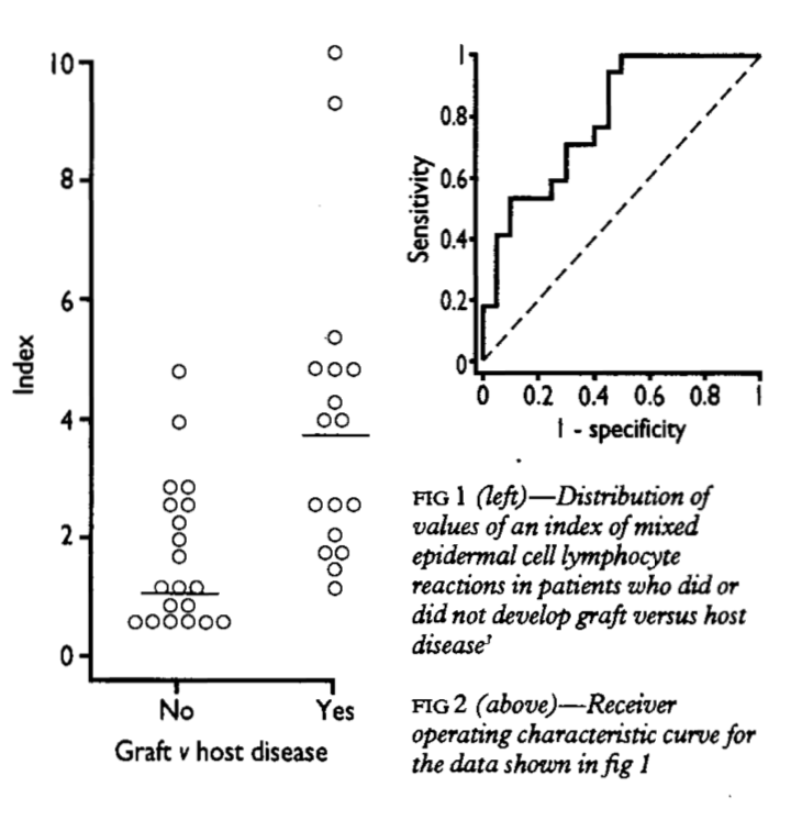
The example shown in Figure 1 uses graft versus host disease, with an index measurement whose definition is not important. The Yes indicate cases and No indicate controls in our terminology, respectively. The usefulness of the test for predicting graft versus host disease will clearly relate to the degree of non-overlap between the two distributions. A ROC plot is obtained by calculating the
- sensitivity and
- specificity of every observed data value and plotting, as in Figure 2,
- Y axis = sensitivity,
- X axis = 1 - specificity.
A test that perfectly defines cases and cotrols would have a curve that aligns withe Y axis and top. A test that does not work would produce a straight line matching the centerline. In practice, overlaps always occur such that the curve usually lies somewhere between, as shown in Figure 2.
The performance of the test (diagnostic accuracy) is reported as the area under the ROC curve. The area is equal to the probability that a random case has a higher measurement than that of a control. This probability is .5 for a test that does not work (e.g. coin-toss; straight line curve). This discriminatory power assessment is important for a clinical test if it is to be sufficient to discriminate cases and controls.
At this stage we have the global assessment of discriminatory power showing that a test can divide cases and control. A cut off for clinical use also requires a local assessment. As per Altman and Bland; the simple approach of minimising “errors” (equivalent to maximising the sum of the sensitivity and specificity) is not necessarily best. We must consider any type of costs of
- false negatives
- false positives
- and prevalence of disease in the test cohort.
In their example:
- cancer in general population
- most cases should be detected (high sensitivity)
- many false positives (low specificity), who could then be eliminated by a further test.
For comparing two or more measures, the ROC plot is useful. The curve wholly above another is clearly the better test. Altman and Bland cite a review for methods for comparing the areas under two curves for both paired and unpaired data.
In my (reccomended) pocket-sized copy of Oxford handbook of medical statistics (Peacock & Peacock, 2011), a clinical example uses a chosen cut-off of sensitivity \(>81\%\) and specificity \(28\%\). The area under ROC curve was .65, thus a moderately high predictive power. The accuracy (proportion of all correctly identified cases) was \(\frac{ 30 + 42 }{ 185 } = 39\%\)
Example ROC cuvre
To implement this method, I include here an example in R code.
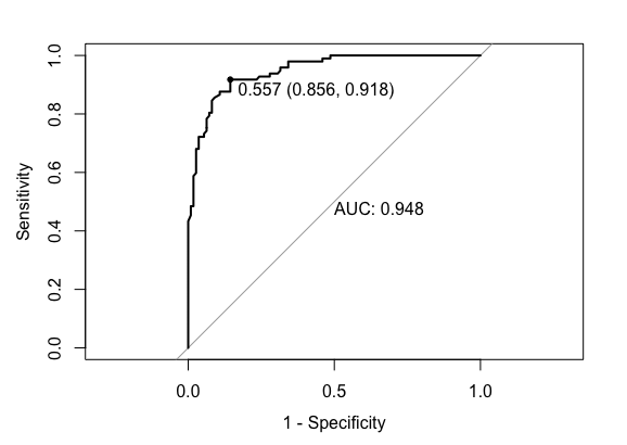
# Modified example from https://stackoverflow.com/questions/31138751/roc-curve-from-training-data-in-caret

library(caret)
library(mlbench)

# Dataset
data(Sonar)
# An example dataset for classification of sonar signals using a neural network. The task is to train a network to discriminate between sonar signals bounced off a metal cylinder and those bounced off a roughly cylindrical rock. Each pattern is a set of 60 numbers in the range 0.0 to 1.0. Each number represents the energy within a particular frequency band, integrated over a certain period of time. Labels: "R" if the object is a rock and "M" if it is a mine (metal cylinder).

ctrl <- trainControl(method="cv",
                     summaryFunction=twoClassSummary,
                     classProbs=T,
                     savePredictions = T)

rfFit <- train(Class ~ ., data=Sonar,
               method="rf", preProc=c("center", "scale"),
               trControl=ctrl)

library(pROC)
# Select a parameter setting
selectedIndices <- rfFit$pred$mtry == 2

# Plot:
plot.roc(rfFit$pred$obs[selectedIndices],
         rfFit$pred$M[selectedIndices],
         print.auc=TRUE,
         print.thres=TRUE, #thresh .557 shown
         legacy.axes=TRUE)

# With ggplot
library(ggplot2)
library(plotROC)
ggplot(rfFit$pred[selectedIndices, ],
       aes(d=( ifelse(rfFit$pred$obs[selectedIndices]=="M",1,0) ),
           m = M
           )) +
  geom_roc(hjust = -0.4, vjust = 1.5) +
  coord_equal() +
  style_roc() +
  annotate("text", x=0.75, y=0.25, label=paste("AUC =", round((calc_auc(g))$AUC, 4)))
References
- Altman, D. G., & Bland, J. M. (1994). Diagnostic tests 3: receiver operating characteristic plots. BMJ: British Medical Journal, 309(6948), 188.
- Peacock, J., & Peacock, P. (2011). Oxford handbook of medical statistics. Oxford university press.
Footnote 1 This article is almost identical to the original version in acknowledgment to Altman and Bland. It is adapted here as part of a set of curated, consistent, and minimal examples of statistics required for human genomic analysis. ↩
Maintained by Dylan Lawless. Scientist at EPFL. Resume and Google scholar. RSS feed